
Overlays for Comparing Trends.
Overview:
The Chart Grouped View displays the values of all metrics in a container as a line graph for the period value selected in the Global Filter as shown in the illustration.
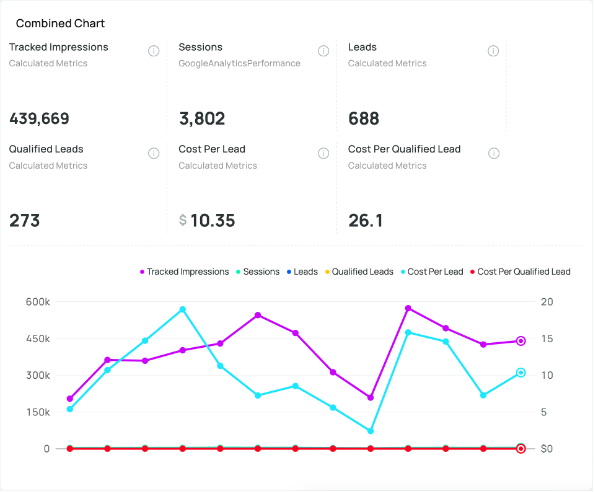
The Chart is generated using the current value of the Global Filter and the prior 12 periods. Highlighting any of the chart nodes displays a summary of all values for the given value of the X axis.