
Detailed Period over Period Comparisons.
Overview:
The Chart Single View displays the value of each metric in the container as a histogram for the prior 12 periods from the period value selected in the Global Filter. It also overlays a line graph with the 12 periods prior to the 12 periods shown on the histogram for a total of 24 periods. This enables the user to view the value of the metric over 24 periods as shown in the illustration below.
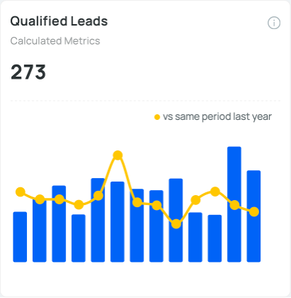
An example of the use of Charts Single is to compare year over year performance. To do this, select Month as the time period on the Global Filter, select a given month in the Global Filter. The Histogram shows the previous 12 months, and the line graph overlay shows the prior year months overlaid over the histogram.
Note this assumes that data for the time period is available for the selected organization in the Global Filter.